


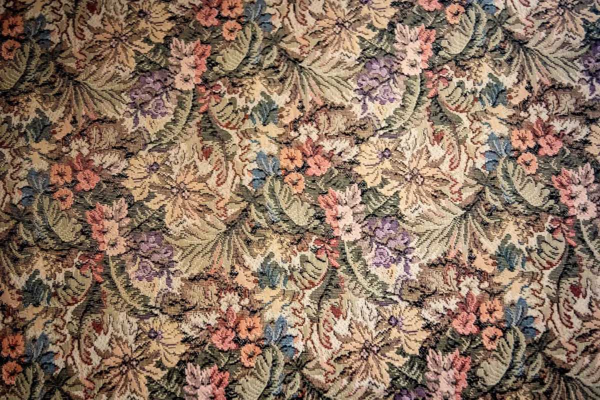
Seasonal Pattern Ideas: Designing a Cosy Autumn Collection for Home Textiles
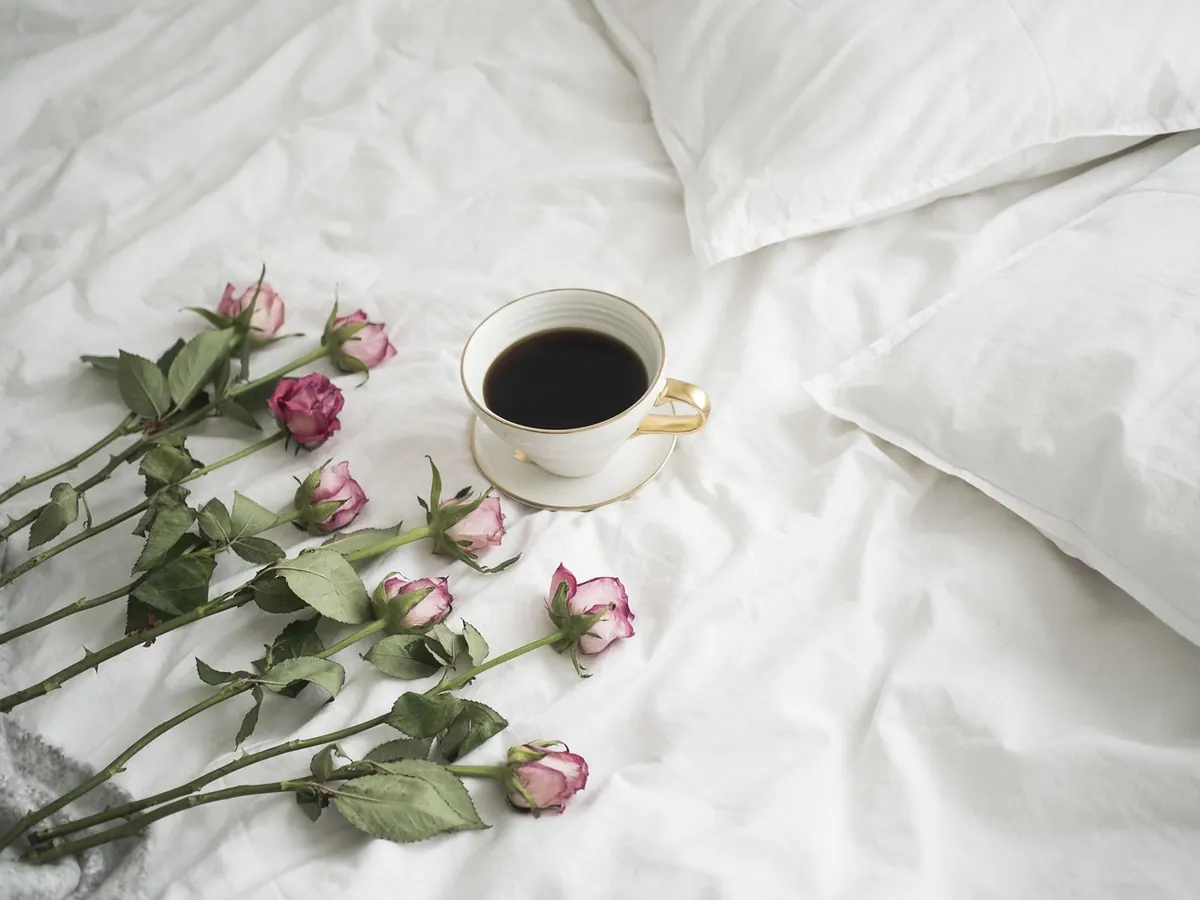
Autumn shows up in the fabric first. The light turns amber, the evenings draw in, and suddenly that pale linen cushion looks thin and a little cold. Designing for the season is less about drawing pumpkins than about building a small, usable collection that earns its keep from September through to February. Get the motifs, palette and repeat scale right and the same designs will work on a sofa, a bed and a supper table without ever looking like a novelty range.
Motifs That Earn Their Keep Beyond October
The trick is to choose subjects with weight and texture rather than obvious seasonal props. A pumpkin reads as a fortnight; an acorn reads as a season. Look for shapes with strong silhouettes that survive being reduced to two or three tones, because most printed textiles are not detailed illustrations.
- Woodland botanicals: oak and maple leaves, acorns, hazelnuts, sweet chestnut cases, seed pods, honesty, dried fern fronds.
- Hedgerow fruit: rosehips, haws, sloes, blackberries, crab apples, quince and pear, often drawn in small clusters rather than singly.
- Harvest shapes: wheat sheaves, barley heads, vine leaves, corn dollies and wide ribbon bows.
- Fauna, kept simple: hares, pheasants, partridges, red squirrels, moths and beetles. Draw them small and stylised, or they tip into folk-art pastiche.
- Structure and weave: tartan, houndstooth, herringbone, blanket stripes, chevrons and marled textures. These carry the season without a single leaf.
Draw from life where you can. A real oak leaf has uneven lobes and a stem that curves; copying that irregularity gives a repeat its warmth. Simplify to a solid shape plus one line of detail, then check it at the size it will actually print. If it still reads at three centimetres, it will work anywhere.
A Muted Palette With Real Warmth
Autumn palettes go muddy when every colour is a mid-tone. Build in three layers instead. Start with a base of oatmeal, stone, ecru or undyed linen. Add mid-tones: russet, ochre, burnt orange, moss, olive, sage. Then choose two accents — damson and blackberry, deep teal, slate blue or charcoal — to give the warmth somewhere to sit against.
A rough proportion of sixty per cent base, thirty per cent mid-tone and ten per cent accent keeps a collection calm. Printing on a natural ground does half the work for you, since the cloth itself supplies the warmth. If you want an evening feel, reverse it: a deep russet or charcoal ground with motifs printed in oatmeal and chalky white reads richer and hides marks better on a table.
One cold accent matters more than people expect. A single slate or teal note stops a russet-and-ochre scheme from looking dusty and gives you something to pull through when the season turns towards winter.
Repeat Scale, Room by Room
Scale should follow viewing distance and the size of the object being covered. A motif that feels generous on a napkin will be dizzying on a throw.
Cushions
On a 45–50cm cushion, a single motif of roughly 8–12cm placed off-centre makes a confident hero panel, with a few smaller elements scattered around it. A tossed ditsy of 15–25mm motifs works as a supporting print, but keep the spacing generous — around one motif-width apart — so it stays airy rather than speckled. Organic shapes sit best in a half-drop repeat; geometrics look sharper in a straight repeat.
Throws and blankets
Throws are seen draped, folded and from across a room, so work at 15–30cm for motifs or use wide stripes, borders and checks instead. Tiny patterns shimmer at distance, which is why woven and knitted throws so often rely on structure rather than print. A border repeat along two edges, or a banded stripe, gives a throw rhythm without overwhelming a sofa.
Table linen
Table linen is viewed from roughly half a metre, and much of it disappears under plates. Keep contrast low and scale modest: a 2–4cm motif on a 45cm napkin, or a border and corner motif rather than an allover scatter. Runners can carry a slightly larger repeat because they are read as a long band. Allover patterns are lovely on a tablecloth, but choose one with plenty of ground showing between motifs, or the table looks busy before the plates arrive.
Building a Collection That Mixes Without Matching
Four pieces will cover most of the season: one hero print, one secondary texture, one plain in the base neutral, and one accent solid. Keep the palette identical across all four and vary only scale and texture. Then a cushion, a throw and a tablecloth can be swapped between rooms without a single deliberate match. If a customer buys only one piece, it should still feel complete on its own.
Printing, Weaving and the Details That Show
On textured linen and hopsack, fine line work sinks into the weave, so favour bold shapes with clean edges and slightly more open spacing. Pigment inks sit on the surface and give a chalky, matte finish that suits autumn; fibre-reactive dyes sink in and stay softer through washing, which matters for napkins that see regular hot washes.
Watch the practical points: match repeats across seams on cushions and tablecloths, keep nap and pile direction consistent on velvet and brushed cotton, and allow for a little shrinkage before cutting. Piping, blanket stitching and a contrasting reverse in a solid from the same palette will do more for a collection than one extra motif.
Test the Repeat Before You Print a Metre
Sampling saves money and disappointment. Work through this before committing to a full run:
- Print or mock up a swatch at final size, on the intended cloth if possible.
- Pin it to a cushion or drape it over a chair and step back two metres.
- Look at it under a warm lamp in the evening, not just daylight.
- Lay a plate on the tablecloth sample and check the pattern still reads.
- Hold it against your plain and accent fabrics to confirm the palette holds together.
Then live with the sample for a week. A design that still pleases you on a grey Tuesday in November is the one worth printing.
Photo: monileoni / Pixabay